Redefining security workflows
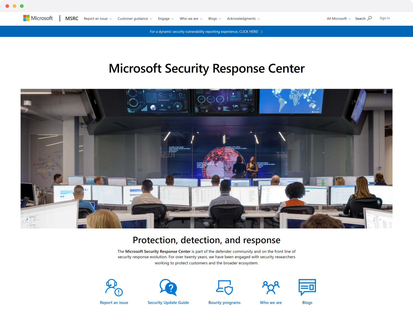
I led the redesign of the Microsoft Security Response Center reporting portal, streamlining submissions, improving transparency, and enhancing usability. The result was a notable increase in vulnerability submissions and 50% portal adoption.
User Need: Simplify the reporting process, clearly show status updates, and make it easier to submit accurate, complete vulnerability reports.
Business Goal: Increase portal adoption, improve data quality, and reduce resource strain from email-based submissions.
Team
Lead Designer (Me)2 Product ManagerSDesign Program ManagerDeveloperAccessibility SpecialistCopywriterDeliverables
User PersonasCompetitive AnalysisUser Stories & FlowsCustomer JourneyWireframesUser TestingVisual DesignPrototypeSpecifications
Duration
2019-2020Tools & Software
FigmaWeb Design System
Problem
Security Researchers struggle to efficiently submit vulnerabilities due to a cumbersome portal experience, unclear submission steps, and limited visibility into report status, leading to frustration, low portal adoption, and additional resource strain.
Challenge
Interviewing users posed unique challenges due to their preference for anonymity. To gain meaningful insights, I connected with internal subject matter experts and relied on established UX best practices and principles to guide the strategy.
Old submission user flow
Defining user’s main goals
To define the users’ main goals, I consulted with security researchers and internal experts to understand their most pressing needs: easier submissions, clearer status updates, and greater transparency. This insight shaped the experience, making it simpler and more user-friendly.
New return user flow
The diverse skills, responsible practices, and proactive efforts of ethical hackers reinforced these goals, all aimed at improving platform security and enhancing user protection.
Design
I applied principles of confidentiality, usability, and consistency, working with Product and Engineering to streamline reporting processes and verify the design through user feedback.
Lofidelity explorations
Result
The redesign sparked immediate improvements: an 8.5% increase in vulnerability submissions and a rise to 50% portal adoption. This progress set a strong foundation, with the team aiming to reach 90% adoption by year-end.
50%
Portal adoption
8.5%
Increase in submissions
Visual Design
Using insights from user feedback, I concentrated on ensuring the vulnerability submission process was clear, intuitive, and easy to navigate—providing researchers with the same comprehensive functionality they relied on, now in a more user-friendly, streamlined interface.
Dashboard screen
Looking back
This project underscored the value of early collaboration between research and engineering. By starting with deeper user insights and aligning technical feasibility early on, future projects can be more efficient and impactful.
What I would do next time
Next time, I’d explore AI-driven approaches to enhance security guidance, streamline authentication, and improve threat detection. This would include offering contextual security tips, adapting authentication requirements based on user behavior, and using AI-powered alerts and reporting tools to make security processes clearer and more intuitive. By integrating these AI-driven features, the experience would become more seamless, proactive, and aligned with user needs.
B2B • CYBERSECURITY • DESIGN STRATEGYThanks for visiting! 🙂
Got a wild idea? A boring idea? An idea you’re not even sure is an idea? I’m in. Send me a message, and we’ll figure it out together.


